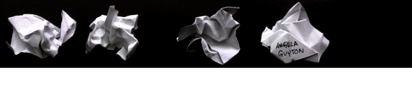


Media for the FluCoMa project
November 2019:
The FluCoMa project put on an amazing performance at HCMF this year. The artists involved were: Olivier Pasquet, Owen Green, Lauren Sarah Hayes, Leafcutter John, and my long-time collaborator, Rodrigo Constanzo.
I made this video about them:
February 2019:
I’ve made the logo and video bumper for FluCoMa
What is FluCoMa?
The Fluid Corpus Manipulation project (FluCoMA) instigates new musical ways of exploiting ever-growing banks of sound and gestures within the digital composition process, by bringing breakthroughs of signal decomposition DSP and machine learning to the toolset of techno-fluent computer composers, creative coders and digital artists.
![]()
To create these I:
1) Used Affinity Designer – this was the first time I made something for someone else using vectors. I normally draw using traditional media (and I’ll occasionally color using Photoshop)
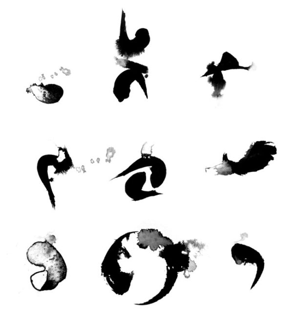
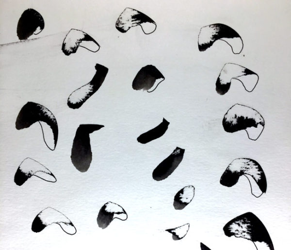
2) Created and filmed many different types of ink behavior, on paper and in water
3) Revisited my aviglitch library scripts from when I made Its Fleece Electrostatic, to create the glitch effects found in the video bumper
4) Used Final Cut to animate the different elements of the logo for the bumper
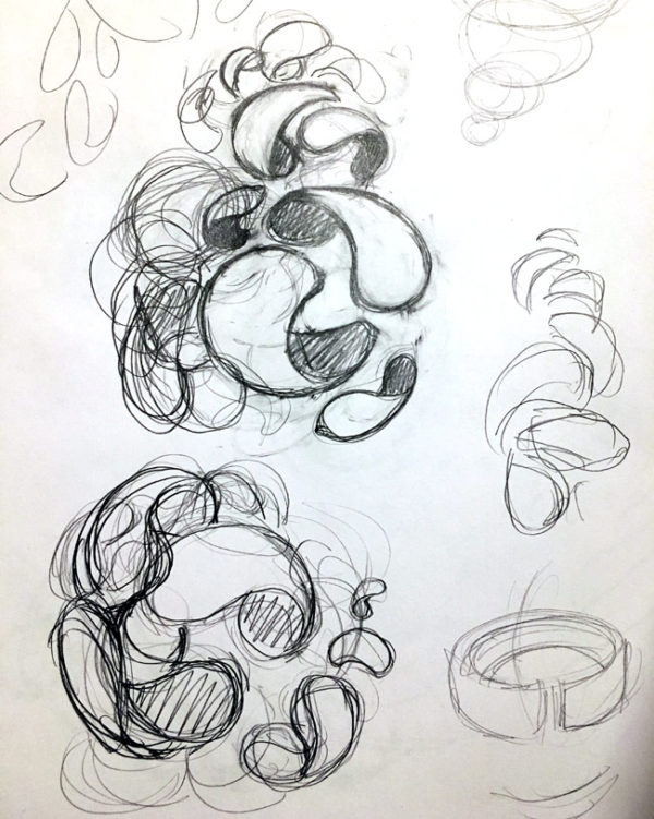
5) And of course just sketched a lot using pencil and paper to get initial ideas down, or to try to change the direction of the design.
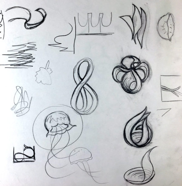
Here are some key moments in the logo’s evolution (Though it wasn’t exactly as linear as this and I’ve left out some things.)
![]()
“Getting warmer” PA would say along the way.
The idea was to (and I’m rephrasing FluCoMa’s brief using my own words, as I understood it):
-bring chaos into concert (not as in “rock concert” but graceful collaboration…which a rock concert can also be :)
-or the many into one, transformed, while not losing that it came from the many
It was important to me to make something that was cool, but also approachable. This is because the project, to an outsider like myself, seems very technical and maybe even a little intimidating. So I didn’t want the logo to feel intimidating. I was very happy when I finally sketched something that felt like a small cup of noodles. Once I hit upon that, it seemed to me to be the ideal feeling to bring into this. As a point of interest, I actually think #7 above is the image that relates to this the most. However, the guys weren’t as completely in love it as I was, so the designing continued.
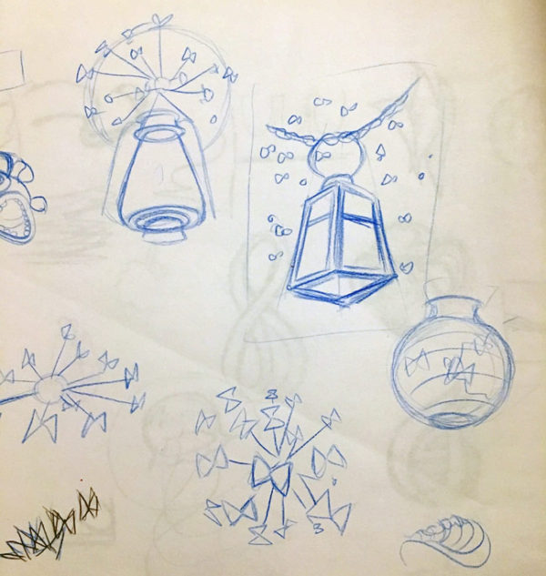
Here are [just some] of the exploratory sketches I did along the way.
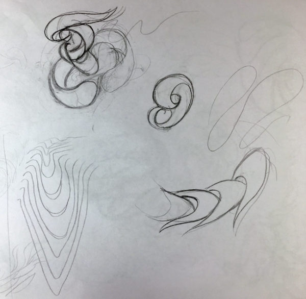
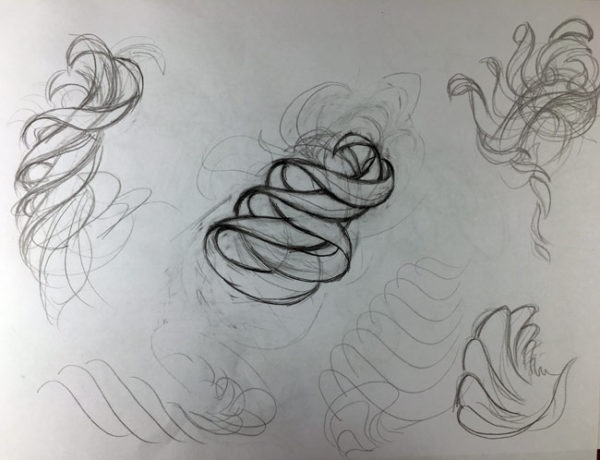
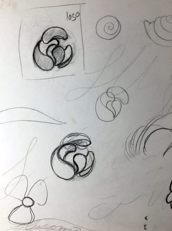
Looking back on this page now, I like how you can see both a propeller and a spiral. The starting place for the logo would come out of this “circle-centric” thinking (this is also what felt like the small cup of noodles!). I like how this strand of thinking includes the idea of the form’s own propulsion. That’s actually really, really, cool if I do say so myself.
Here’s how I presented it to the FluCoMa team in an email I wrote:
– comes apart and comes together
– organic yet geometric (inviting)
– dynamic
– implies a center but space is very important (so it seems futuristic)
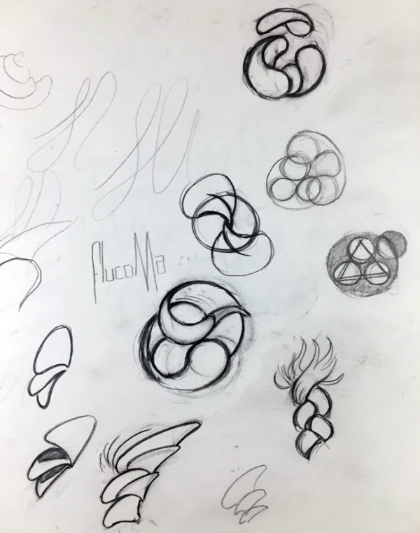
It was also pretty cool tossing a design over and having PA rotate it upside down, or nudge the elements just a little further apart. There are the kind of people that make little adjustments or give opinions just because they like to opine, and then there are the ones that actually have ideas and a vision that are genuinely trying to make something better along with you*. PA is the latter.
(*hint: I’m not always a team player. Actually, sometimes I’ll put myself in collaborative or commission situations just as a sort of bondage exercise…..”How much playing nice can I take!” But that’s maybe a subject for another post :)
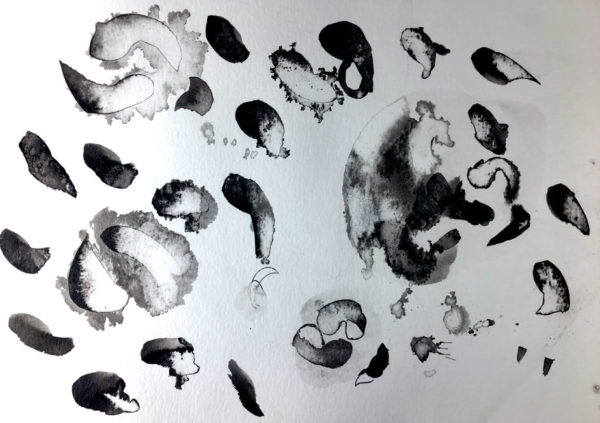
I also made *a lot* of these ink mark drawings. I had to inject something else into what I was doing, which I felt was coming out too rigid, and too small and insignificant. Making these eliminated that quality of smallness in what I was doing.
 And then of course all the various little nudges in the angles and form itself until the final image was sculpted.
![]()

Nothing Rhymes With Rats
This 140 page book collects the comic strips that take our rats on a journey of self discovery….From the cage and nihilism to transcendent hope. Get it HERE.
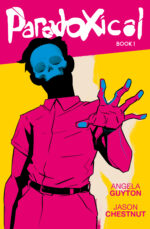
Paradoxical
Reluctant, time-travelling, twins have to solve a paranormal murder mystery set in 1920s Miami. It was co-created with writer Jason Chestnut. We’ve included the first two issues in this 52 page comic book. Get it HERE.
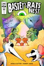
Bastet’s Rats Nest
Our two rats are at it again. This time caught-up in a National Treasure type caper that takes them deeper and deeper into the occult. Co-created with Ramsey Janini, it’s a wild ride. Get the 52 page comic HERE. Or read it on Webtoons first.